The internal rebrand brought wellbeing, learning and development together under one recognisable identity—making colleague support feel more connected, visible and easier to engage with.
Client
M&S Worklife
Role
Brand Identity Creative Direction Brand Guidelines
Sector
Retail
Agency
Whippet, London
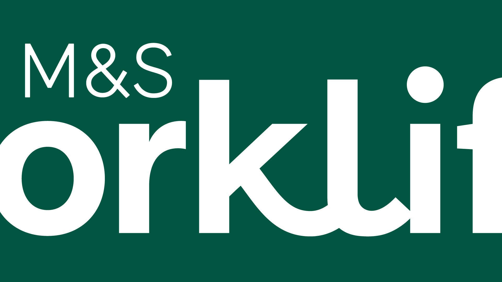
I wanted to build the identity around the idea of bringing people together. The linked letterforms in the wordmark symbolise connection, while the balance-inspired graphic language, vibrant colour palette and approachable typography created a brand that felt warm, inclusive and easy to engage with.


