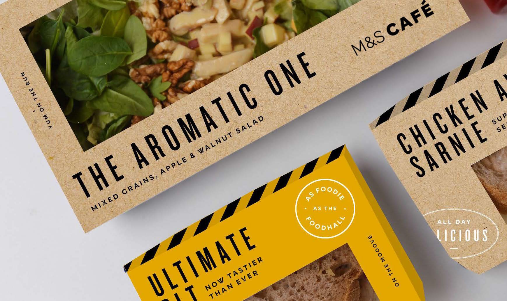
The refreshed identity helped reposition M&S Café as a more distinctive destination, creating a flexible brand system designed to evolve across future campaigns and in-store experiences.
Client
Marks & Spencer
Role
Brand Identity Photography Direction Packaging Design Brand Guidelines
Sector
Retail
Agency
Whippet, London

I wanted to develop a new visual identity inspired by the modern-day bakery. Rather than moving away from the M&S brand, I built on its existing equity, introducing bold black and white graphic patterns, artisanal stamp-inspired lock-ups to reinforce a sense of quality, and an eclectic mix of typefaces to create a distinctive visual language.
Recycled packaging materials reinforced a sense of craft and quality, while a bright yellow accent colour brought contrast and impact throughout the customer journey. I also helped shape the photography direction, capturing food in natural table settings with softly blurred café environments to create a stronger sense of place and make the café feel more inviting.
The visual language extended across the in-store environment, menu boards, packaging and digital, creating a cohesive and recognisable brand experience with the flexibility to evolve over time.